What Is Data Visualization?
Data visualization is the process of representing data through visual elements like charts, graphs, and maps. It helps make complex information more accessible, enabling easier identification of trend
More about Data Visualization:
Let's explore the world of data visualization! At its core, data visualization is the art of representing data through visuals like graphs, charts, maps, and more. These visuals make it easier for us to interpret complex data, helping us spot patterns, trends, and relationships that raw numbers might hide. Think of it as translating data into a visual language we can all understand.
Fun fact: Data visualization isn't a new concept! It dates back centuries when explorers used maps to present information. However, the real boom in data visualization came in the latter half of the 20th century. With the rise of computers, statisticians had more powerful tools to store, analyze, and present data faster and more effectively. Over the past 30 years, data visualization has grown immensely, and today, we have a variety of tools to create stunning, insightful visuals.
Did you know that people are more likely to engage with content that has visuals? In the fast-paced world of social media, visual data representation is key. Whether it's a graph showing your social media performance or an infographic breaking down trends, visuals grab attention. Ultimately, this helps improve ROI, engagement and brand awareness.
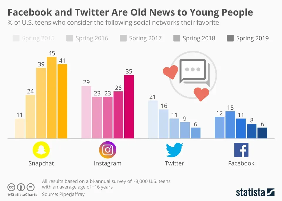
Let’s explore a data visualization from Statista that illustrates the demographics of social media platforms in the US!
Here are some tips for using social media data visualization effectively:
- Know Your Audience: Before creating a report or presentation, it's crucial to understand who you're addressing, whether clients, colleagues, executives, or teams. Ensure the data is gathered and displayed in a way that’s easy for them to comprehend.
- Choose Graphs Carefully: With various graph options available, selecting the right one can be challenging. Make sure to pick a graph type that best represents your data and is easily understandable to your audience.
- Simplicity is Key: Keep your data presentation clear and straightforward. Avoid overloading it with too many colors, values, or excessive logos and clipart. Focus on simple charts with relevant numbers to maintain clarity and effectiveness.
Let’s dive into the Types of Data Visualization:
- Tables: Organize data in rows/columns; best for detailed or numerical data.
- Graphs: Use lines, curves, or points to show trends and relationships (e.g., Line graphs, Scatterplots).
- Charts: Display data along two axes for comparisons (e.g., Bar charts, Pie charts).
- Maps: Visualize geographical data and spatial relationships (e.g., Heat maps, Treemaps).
- Infographics: Combine visuals and text to present complex data engagingly.
- Dashboards: Integrate multiple charts/graphs for real-time data monitoring.
Did you know that effective data visualization can dramatically improve communication? When done right, it brings clarity to complex data, allowing marketers and businesses to make informed decisions quickly. Plus, it makes data storytelling so much more engaging! So the next time you're looking at a data report, consider how a simple chart or infographic can make all the difference.